%20(1).avif)




An ERP buyer does not arrive at your website with one question. They arrive with a stack of risks.
Can this team handle our data? Do they understand our sector? Will they disappear after go-live? Can they integrate with the systems we already use? Will the project create more work for operations? Can the budget and scope survive procurement?
Most ERP websites answer those questions badly. They lead with platform logos, generic transformation copy and a “Book a demo” button. The page may look professional, but it has not earned the meeting.
What Should an ERP Website Prove?
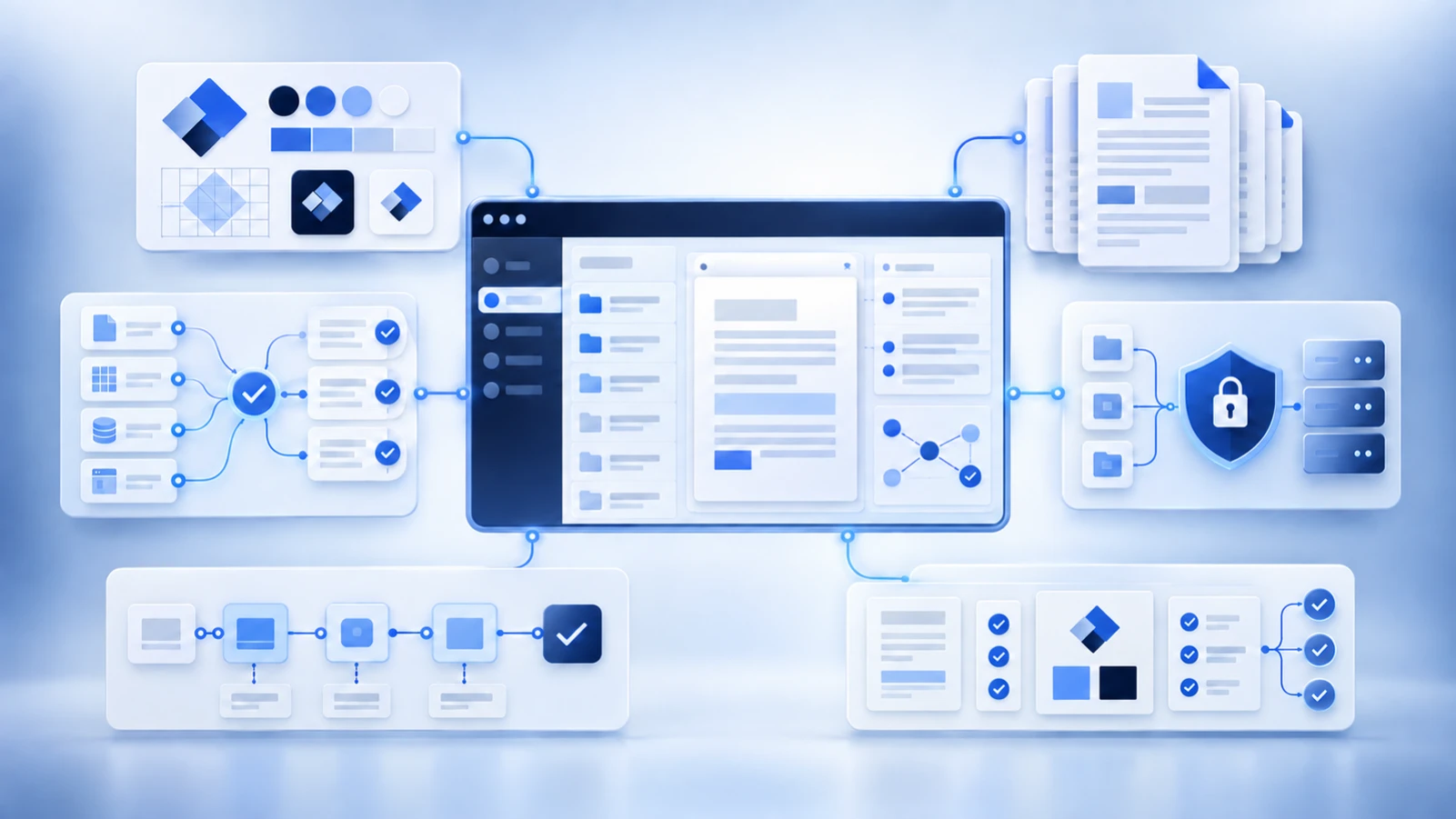
An ERP website should prove five things before a buyer books a demo: precise fit, credible delivery, technical capability, commercial clarity and a safe next step. The job of ERP website design is to organize that evidence so each member of the buying group can find what they need without decoding vague agency language.
| Buyer | Question in their head | Evidence the website should provide |
|---|---|---|
| Finance | Will the project produce value without losing budget control? | Business outcomes, scope logic, cost drivers, reporting value and a realistic business-case process |
| IT | Will this fit our architecture and create manageable risk? | Integration approach, data strategy, security, environments, support boundaries and technical team credibility |
| Operations | Will the system improve the process or simply digitize a bad one? | Workflow knowledge, discovery method, role-based examples, adoption plan and relevant outcomes |
| Procurement | Can we compare the offer and hold the supplier accountable? | Clear services, assumptions, responsibilities, governance, legal entities and procurement-ready contact details |
| Executive sponsor | Can this partner guide a high-risk change? | Strong point of view, senior ownership, decision framework and credible proof |
Pass the First-Screen Test
The first screen should state who the firm helps, the type of ERP work it does and why that matters. It should not make a buyer scroll through an abstract brand statement to discover whether you implement, resell, support or advise.
A useful first screen normally contains:
- A specific audience or situation
- The platform, service or project category
- A concrete business outcome or risk reduced
- One primary action
- An immediate proof signal such as a verified partnership, named customer, sector focus or documented method
Weak ERP homepage copy
Accelerate transformation with innovative, end-to-end solutions that empower your business.
Stronger ERP homepage copy
Dynamics 365 implementation and managed support for multi-site manufacturers that need clearer production, inventory and finance data.
The second version is narrower, but that is the point. It gives the right buyer a reason to continue and the wrong buyer a reason to self-select out.
Build the Information Architecture Around Decisions
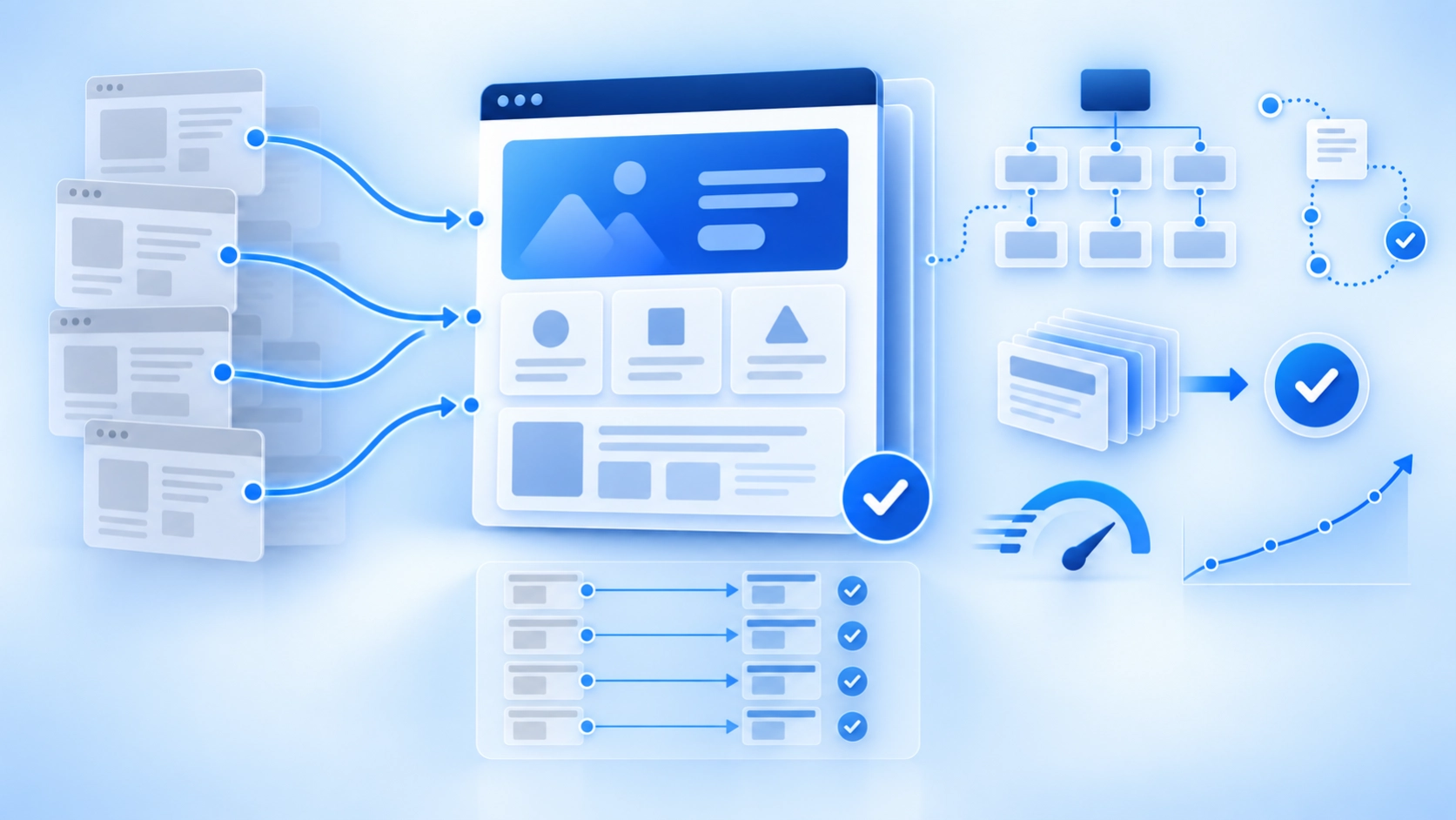
A serious ERP website needs more than a homepage, services page and contact form. The structure should reflect how the buying team researches risk.
| Page type | Purpose | Evidence to include |
|---|---|---|
| Platform page | Prove ecosystem knowledge | Supported products, project types, integrations, verified partner status and team experience |
| Industry page | Show process and regulatory context | Sector workflows, common failure points, examples and relevant outcomes |
| Service page | Explain scope and accountability | Inputs, outputs, responsibilities, exclusions, process and next step |
| Success story | Make delivery evidence usable | Starting situation, constraints, work completed, evidence, outcome and limitations |
| Team or author page | Show who gives the advice | Real role, relevant experience, named work and verifiable credentials |
| Resource page | Answer the next buying question | Checklists, comparisons, planning guides and technical explanations |
This structure also supports SEO because each page serves a distinct intent. It avoids forcing one long services page to rank for every platform, sector and project type.
Show Platform and Integration Proof Precisely
ERP websites often misuse platform logos. A logo does not tell the buyer whether the firm is a licensed reseller, implementation partner, consultant, integration specialist or simply familiar with the product.
State the relationship accurately. Link to a public partner listing where one exists. Name the areas of the product the team works with. Explain the systems commonly integrated and where another specialist may be needed.
This is where NexaFlow’s MSP, Azure and Microsoft background is useful. Technical buyers notice when marketing copy treats infrastructure, identity, data, APIs and support as interchangeable. The website should use correct language and let a qualified person review technical claims before publication.
Source check: Microsoft’s own implementation guide separates areas such as architecture, environments, data, security, integrations, performance, training and support. A credible partner website should show how its work relates to those realities. See Microsoft’s Dynamics 365 implementation guidance.
Turn Case Studies Into ERP Success Stories
A logo carousel is not a case study. A useful ERP success story gives the buyer enough context to judge whether the experience transfers to their situation.
- Starting point: system, process, company type and reason for change
- Constraints: data, integrations, locations, timeline, regulation or adoption
- Scope: what the seller did and did not do
- Approach: discovery, design, implementation, testing, training and support
- Evidence: documented changes, screenshots, process improvements or verified results
- Limitations: what cannot be concluded from the example
Do not invent a percentage improvement because the page looks stronger with a number. If a client cannot approve a metric, use verifiable operational evidence instead.
Design for Reading, Accessibility and Performance
ERP content is dense. Good visual design makes it easier to understand without hiding the substance.
- Use descriptive H2 and H3 headings
- Keep important answers in text rather than images
- Use diagrams for architecture or process explanations
- Use tables for comparisons and responsibility maps
- Give every useful image descriptive alt text
- Maintain readable contrast, keyboard access and clear focus states
- Test real pages on mobile instead of trusting the desktop canvas
Source check: WCAG 2.2 is the current stable accessibility reference. Accessibility should be part of design and QA, not a badge added at the end. See the W3C WCAG overview.
Source check: Performance affects the user experience and should be measured on the real site. A fast template does not guarantee a fast production page once scripts, video and third-party tools are added. See Google’s Core Web Vitals guidance.
Use Conversion Paths That Match Buyer Readiness
Not every visitor is ready for a demo. A single hard CTA loses people who still need to assess fit.
Use a small set of next steps:
- Book a discovery call for buyers with a defined project
- Request a website or project review for buyers diagnosing a problem
- Download a planning checklist for early-stage research
- View a relevant success story for proof
- Meet the delivery team for credibility
Forms should ask only for information the team will actually use. If the sales process requires company size, ecosystem and project type, ask for those. Do not add fields because a CRM supports them.
A 30-Point ERP Homepage Review
A practical review can be organized into six groups of five checks.
- Positioning: audience, platform, service, outcome and differentiation are clear.
- Proof: partnerships, customers, team, method and results are specific and verifiable.
- Buyer coverage: finance, IT, operations, procurement and executives can each find relevant evidence.
- Technical trust: integration, data, security, support and implementation claims are accurate.
- Experience: navigation, mobile, accessibility, speed and readability are tested.
- Conversion: CTAs, forms, success stories, service links and tracking work.
A beautiful homepage that fails three of these groups needs structural work, not another animation.
When Should an ERP Company Redesign Its Website?
Redesign when the site no longer reflects the offer, hides the company’s specialization, cannot support new content, creates sales objections or makes routine updates difficult. Do not redesign only because the visual style feels old.
Sometimes the correct answer is a focused repair: rewrite the homepage, build industry pages, add proof and improve the CMS. A complete rebuild is justified when the underlying structure and platform prevent those changes.
A Practical ERP Website Page Blueprint
The exact page count varies, but the first release should cover the decisions that appear in sales conversations.
| Page | Core question | Required review |
|---|---|---|
| Homepage | Who is this for and why should the buyer continue? | Founder, sales and delivery |
| Platform page | What does the team genuinely do in this ecosystem? | Platform specialist and partner manager |
| Industry page | Does the company understand our workflows and risks? | Sector specialist |
| Service page | What is included, how does it work and who owns what? | Service owner and operations |
| Success story | Is the experience relevant and the evidence approved? | Customer owner, legal and delivery |
| Team page | Who will advise or deliver the work? | Named team member |
| Contact journey | What happens after the form? | Sales operations and privacy owner |
Do not launch empty platform or industry pages simply to make the navigation look larger. A thin page creates no trust and can compete with a stronger page for the same search intent.
Plan the CMS Before Migrating Content
A Webflow build should define reusable fields for titles, introductions, rich text, authors, review dates, categories, SEO metadata, images, FAQs and any proof components. The model should make the correct structure easy for editors to repeat.
Before migration, inventory every current URL and decide whether it will be retained, improved, redirected or removed. Record the old URL, new URL, primary purpose, index status and owner. Redirecting every old page to the homepage is not a migration plan.
Keep evergreen URLs where possible. A title can include a year when annual updates are guaranteed, but the slug normally should not.
Check the Demo and Form Experience End to End
Test the journey as a buyer, not only as the person who built the page.
- Submit the form on desktop and mobile.
- Confirm validation and error messages are usable.
- Check the confirmation page and email.
- Confirm analytics and CRM events fire once.
- Verify the correct owner receives the enquiry with source context.
- Review the first sales response for relevance and speed.
A strong page cannot compensate for a broken form, a calendar with no availability or a generic automated reply.
Add Security and Privacy Detail Without Writing Legal Fiction
An ERP seller may handle sensitive commercial and project information during discovery. The website should explain how enquiries and downloads are processed, link to current privacy information and avoid collecting data that is not needed.
Do not ask the design team to invent security claims. Use approved wording from the responsible technical or legal owner. If a trust center, data-processing agreement or security document exists, make it easy for serious buyers to find.
Related ERP Website and Marketing Guides
- Build the wider ERP marketing system
- Fix ERP positioning and brand sameness
- Connect the website to committee-sale collateral
- Prepare the site for ChatGPT and AI search retrieval
Does Your ERP Website Earn the Demo?
NexaFlow designs and builds Webflow websites around buyer questions, proof and conversion paths. The work can include positioning, page architecture, copy, design, development and ongoing management, depending on what the current site actually needs.