In 2026, your SaaS website is not a brochure, it is part of the product. Buyers expect instant clarity, proof, and a way to experience value before they talk to anyone. If your site is still “pretty pages + vague copy + a demo button”, it’s behind. This guide breaks down the trends that actually matter, what to ignore, and what to build if you want your website to pull its weight.
The 2026 Reality Check: Your Website Is Now Part of the Buying Process
Founders keep treating the website like something you “get done” after the product. That mindset is trash in 2026.
Here’s what changed:
- Buyers do more research without you.
- Teams are under pressure to justify spend.
- Trust and security questions show up earlier.
- “AI-powered” is not a differentiator anymore, it’s table stakes.
So your site has one job: make the right people understand the value in seconds, believe you can deliver it, and take the next step with confidence. Not “tell your story”. Not “look modern”.
If you are rebuilding your site based on trends you saw on a funded startup’s homepage, you’re copying outcomes without understanding the inputs. That is how you end up with a nice redesign and worse conversions.
Trend 1: Brutal Clarity Wins, Vague “AI” Messaging Loses
In 2026, attention is shorter and skepticism is higher. Your homepage has about five seconds to answer:
- Who is this for?
- What problem does it solve?
- Why should I trust it?
- What do I do next?
If your H1 is something like “The future of intelligent workflows”, you’re forcing the visitor to do mental work. They will not.
What to do instead
- Lead with the outcome, not the category label.
- Name the user and the job-to-be-done.
- Cut filler words that sound like a pitch deck.
A simple format that works:
- “For [role/team], [product] helps you [outcome] by [mechanism], without [main pain].”
Then back it up immediately with one line of proof: a number, a specific result, a recognizable logo, or a concrete use case.
Trend 2: Product-First Experiences Replace “Big Hero + Stock Graphics”
Static screenshots and abstract illustrations are dying. Not because they look bad, but because they don’t reduce risk.
The fastest way to build belief is to let the visitor see the product doing the job.
What’s working in 2026
- Short looping UI clips that show the core workflow
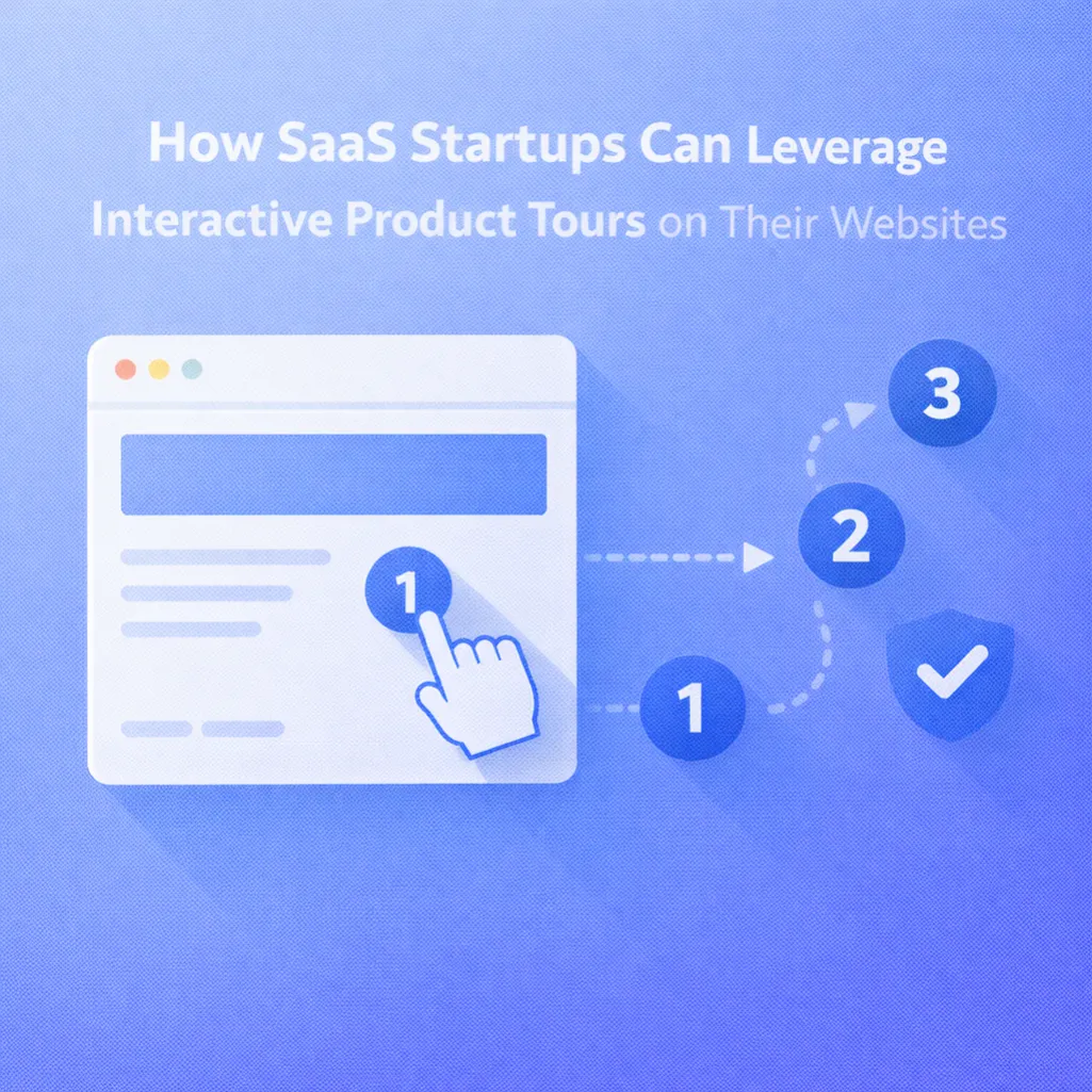
- Interactive “micro-demo” sections (click-through, guided preview, sandbox-lite)
- ROI calculators, estimators, or interactive comparisons
- Real examples of outputs (reports, dashboards, automations, summaries)
The point is not to show every feature. The point is to show the first win.
If your product is complex, your website has to do the first chunk of onboarding. Not with a 9-step tour that nobody finishes, but with a focused path that answers “what happens if I try this?”
Trend 3: AI-Powered Personalisation Gets Practical
Most “personalisation” is fake. Swapping a headline based on location is not personalisation, it’s decoration.
Real personalisation in 2026 is about relevance:
- Industry specific pain points
- Role specific outcomes
- Proof that matches the visitor’s world
- CTAs that match intent (trial vs demo vs audit)
What founders should build
- A handful of clear paths: by role, by industry, by use case
- Dynamic proof blocks: case studies, logos, metrics that match the visitor segment
- Pricing and packaging that speaks to how the buyer thinks (teams, usage, value units)
You do not need 50 landing pages. You need a small set of strong ones that actually differ, not the same page with nouns swapped.
Trend 4: Trust Is Not a Footer Section, It Sits Next to the CTA
Trust is now a baseline requirement, even for smaller deals. Buyers want to know you’re not a risk.
If your trust signals live in a “Testimonials” section halfway down the page, you’re doing it wrong. Trust needs to show up at the moment of decision.
What “trust” looks like on a SaaS website in 2026
- Specific outcomes (numbers, time saved, error reduction, uplift)
- Proof of real adoption (logos, quotes with context, use case details)
- Clear security posture (SOC 2, GDPR, data handling basics, access control)
- Procurement-friendly assets (security page, FAQ, documentation, clear policies)
Also, stop using vague social proof like “Trusted by teams worldwide.” That line means nothing.
Trend 5: Performance and Mobile UX Are Not “Nice to Have” Anymore
Speed is not a flex, it’s the cost of entry.
If your site loads slowly, you pay for it twice:
- you lose the visitor
- your paid traffic becomes more expensive because the landing experience is weaker
Mobile matters even for B2B. Decision-makers click links while travelling, between meetings, or during downtime. If your mobile layout is cramped, awkward, or full of heavy interactions, you’re killing intent.
Non-negotiables
- Fast load time on mobile
- Clean typography, scannable layout
- CTAs that are easy to tap
- Forms that are frictionless (and short)
Fancy animations are fine if they serve the content. If they exist to look “premium,” they are often just slowing you down.
Trend 6: Tracking and Attribution Become the Difference Between “Marketing” and Guessing
This is the part most founders avoid because it is boring, and it costs them money.
If you cannot answer these questions, your site is a black box:
- Which pages create qualified pipeline?
- Which channels bring buyers, not browsers?
- Where exactly do users drop off?
- What happens after the form submit?
- Which leads become customers?
In 2026, a “good looking website” without proper tracking is basically a blindfold.
What you need
- Proper GA4 setup (events that matter, not vanity)
- CRM integration (HubSpot, Pipedrive, whatever you use)
- Source tracking from first click to close
- Lead quality tagging (so sales and marketing agree on what “good” is)
If your agency says “we’ll set up GA4” but can’t tell you what events you need and why, that’s a red flag.
Trend 7: Websites Move From “Marketing Pages” to “Conversion Systems”
The strongest SaaS sites in 2026 are built like systems:
- They guide the right visitor down the right path
- They remove uncertainty with proof and clarity
- They make the next step obvious
- They create a reason to act now without being pushy
A practical 2026 homepage flow
- Outcome-led H1 + proof
- Show the product solving the problem (fast)
- Who it’s for, with clear segmentation
- How it works (simple, not technical theatre)
- Proof and results (with context)
- Trust and risk reduction (security, FAQs, process)
- CTA with low friction (demo, trial, or an audit)
If your site tries to speak to everyone, it converts no one.
What NexaFlow Would Tell a Founder Doing This Today
If you want your website to stay competitive in 2026, stop chasing trends and build around buyer behaviour.
Here’s the short checklist:
- Can someone understand your value in five seconds?
- Do you show the product doing the job?
- Is your proof specific, and placed near decision points?
- Can buyers find answers to trust and security questions quickly?
- Does the site load fast on mobile?
- Can you track from click to closed revenue?
If any of those are “no,” fix that before you add more pages, more animations, or more copy.
If you want, NexaFlow can audit your current site and show you exactly where you’re losing people, what to change, and what to prioritise first. No fluff, just the gaps and the fixes.