SaaS brand identity is created through product design by treating every surface a user touches, the UI, the onboarding flow, the screenshots on your marketing site, the microcopy, the dashboard, as a brand decision, not just a functional one.
Most SaaS companies separate the two. The marketing team owns the brand. The product team owns the interface. The result is a website that sells one version of the product and a product that delivers a different experience once the buyer gets inside. That gap is where trust breaks down, often before a sales conversation even starts.
This guide covers how to build brand identity into your SaaS product design, which surfaces matter most, what the disconnect between marketing site and product actually costs, and how to fix it.
Why your product interface is your most important brand surface
A SaaS product has no physical form. The buyer cannot hold it, try it in a store, or get a feel for it before committing. Everything they use to make a judgment comes from what they can see: the marketing site, the product screenshots, the UI previews, the onboarding flow, and eventually the product itself.
That means every visual decision made inside the product is also a brand decision. The colour of a button, the style of an icon, the language in an error message, the layout of a dashboard, all of these communicate something about the company behind the product. Whether that communication is intentional or not, the buyer is receiving it.
The brands that get this right, Slack, Notion, Figma, Linear, do not treat the product UI and the marketing site as separate design problems. They treat them as the same brand system expressed across different surfaces. The result is that a buyer can move from a homepage to a product trial and never feel a gap between the promise and the reality.
Most SaaS companies are not there yet. And the cost of that gap is measurable.
The disconnect problem: what it actually costs
When Nexaflow works with SaaS clients on their marketing sites, one of the most common issues is not the website itself. It is the gap between the website and the product.
The pattern is consistent. The marketing site uses polished gradients, bold typography, and high-end visuals. The product UI is more functional, plain, or dated. The website uses one style of icons and illustrations. The product uses another. The colours, button styles, dashboard previews, and terminology on the marketing site do not match what users actually see inside the platform.
The biggest issue is not that the website looks too good. The issue is that the buyer starts to feel a gap between the promise and the reality.
For a SaaS company, that matters because the website is where the buyer builds their first picture of the product. If the product screenshots feel inconsistent, outdated, or disconnected from the site design, it creates quiet doubt. The buyer may not say "I do not trust this brand." They are more likely to think "This looks less polished than I expected" or "Is the product actually as good as the website makes it seem?"
Messaging disconnects compound this. The marketing site talks about speed, automation, or simplicity, but the product visuals on the page do not make that outcome obvious. If the screenshots look busy, unclear, or overly technical, the buyer has to work too hard to connect the product to the benefit being promised.
That creates friction before the sales conversation even starts. Fewer people click through to book a demo. More buyers arrive with doubts. Sales calls begin with the team having to explain things the website should have already made clear.
This is the part of SaaS branding that generic brand identity guides do not cover, because most of them stop at the guidelines document and never follow the buyer through to the product itself.
The 6 surfaces where SaaS brand identity lives inside the product
1. The marketing site and product screenshot alignment
The most visible brand surface for most SaaS companies is the product screenshots, UI previews, and dashboard mockups on the marketing site. These are the first time a buyer sees what the product actually looks like, and they carry enormous weight.
If those screenshots feel dated, cluttered, or visually inconsistent with the rest of the site, the buyer registers a mismatch. If they look polished and clearly show the outcome the product creates, they reinforce the promise.
Getting this right means treating product screenshots as designed assets, not raw exports. That means cleaning up dashboards before screenshotting them, removing noise from complex interfaces, using consistent UI mockup styles across the site, and making sure what the buyer sees on the marketing site is a fair and clear representation of what they will find inside the product.
When Nexaflow fixes a SaaS marketing site, one of the first things reviewed is whether the website visuals, product screenshots, UI previews, button styles, terminology, and messaging feel like one connected experience. If they do not, the site gets adjusted so it represents the product more clearly, not just more attractively.
2. The onboarding flow
Onboarding is the highest-stakes brand moment in any SaaS product. It is the first time the buyer moves from prospect to user, and it is the moment where the gap between the marketing promise and the product reality is most exposed.
A SaaS company that markets itself around simplicity but delivers a confusing, multi-step onboarding flow has a brand problem, not just a UX problem. The product experience contradicts the brand promise at the exact moment it matters most.
Onboarding design that reinforces brand identity covers the visual consistency of setup screens with the marketing site, the tone of the copy used during the process, the speed at which the user reaches the first moment of value, and whether the empty states and placeholder screens communicate the brand personality or just fill space.
Empty states deserve specific attention. Most SaaS products invest heavily in how the product looks when it is full of data and activity, and almost nothing in how it looks when a new user first logs in and sees nothing. That first screen is a brand moment. A well-designed empty state communicates what the product does, why the user should take the next step, and what they can expect when they do. A neglected empty state communicates that the company did not think about what it is like to be a new user.
3. Microcopy
Microcopy is the small text that appears throughout a SaaS product: button labels, error messages, tooltip text, confirmation copy, loading states, form instructions, and notification language.
Most SaaS companies treat microcopy as a functional task handled by whoever is building the feature at the time. The result is a product where "Delete" appears in one section and "Remove" in another, where error messages range from terse and technical to apologetic and wordy, and where the brand voice defined in the marketing guidelines has no presence inside the product at all.
For buyers evaluating the product, microcopy is one of the clearest signals of how much care the company puts into the details. A product where the copy is consistent, clear, and reflects a defined brand personality communicates that the company is thoughtful. A product where the copy is inconsistent or clearly functional communicates that brand stops at the homepage.
Standardising microcopy means writing a short set of rules for how the product speaks: what words it uses for common actions, how it handles errors, how it addresses the user, and what it says when something goes right. These rules should come from the same brand voice document that governs the marketing site, not be written independently by the product team.
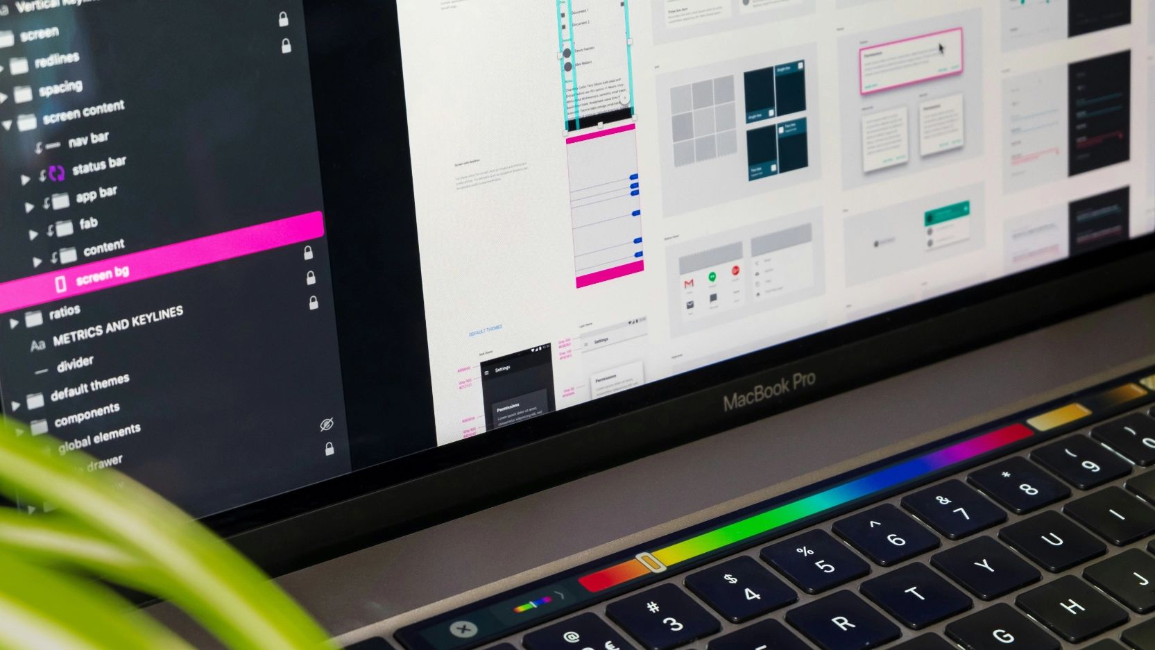
4. The visual design system inside the product
A visual design system is the set of rules and components that govern how the product looks at every screen: colour usage, typography hierarchy, button styles, icon style, spacing rules, and component behaviour.
Without a design system, SaaS products accumulate visual debt. Different features built at different times by different designers or developers produce slightly different visual treatments. Buttons look slightly different on different screens. Icons from different icon sets appear side by side. Colours drift from the brand palette over time. The product starts to feel like it was assembled rather than designed.
For buyers, this visual inconsistency is a trust signal. A product that looks consistent and deliberate communicates that the company has processes, standards, and a long-term view. A product that looks assembled communicates the opposite.
Building a design system for a SaaS product does not require a large team or a long timeline. It requires making explicit decisions about the visual rules that already exist implicitly, documenting them, and building a component library that makes it faster to build new features correctly than incorrectly.
The component library and the design system should be connected to the same visual language as the marketing site. If the marketing site is built in Webflow, the colour tokens, typography choices, and component styles used in the Webflow build should map directly to what is used inside the product. That connection is what prevents the visual drift that creates the mismatch buyers notice.
Nexaflow builds Webflow sites and brand systems together, so the component library, the typography system, and the colour palette used in the marketing site are developed with the product UI in mind from the start.
5. The demo and sales experience
For most SaaS companies, the demo is the most important brand moment in the sales process. It is the first time a prospect sees the product moving, and the visual quality of that experience shapes their confidence in the product and the company.
A demo that uses a cluttered, dated, or inconsistent UI undermines the sales narrative, even if the product is genuinely good. A demo that uses a clean, visually consistent interface, with real data that makes the product value obvious, reinforces it.
This extends to sales decks and presentation materials. The pitch deck used by the sales team should look like it was designed by the same team that built the website. If the website uses one visual language and the deck uses another, the buyer receives a signal that the company is fragmented internally, even if that is not true.
Nexaflow's retainer covers brand, web, and deck design under one fixed monthly price, starting at $2,000 per month, so every surface a buyer sees in the sales process looks like it came from the same place.
6. In-product marketing and upgrade flows
For product-led SaaS companies, the product itself is the primary acquisition and expansion channel. In-app notifications, upgrade prompts, feature announcements, and trial expiry messages are all brand surfaces that most companies treat as functional rather than designed.
An in-app upgrade prompt that is visually inconsistent with the rest of the product, or that uses a different tone from the marketing site, creates a jarring moment at the exact point where the user is being asked to take a commercial action. That inconsistency creates hesitation.
Designed in-product marketing treats upgrade flows, feature gates, and trial CTAs with the same visual and copy standards as any other marketing surface. The message is clear, the visual treatment is consistent, and the path from interest to action is obvious.
How to audit the gap between your marketing site and your product
Before fixing the disconnect, you need to see it clearly. Here is a practical audit process.
Step 1: Pull up both screens side by side. Open your marketing site homepage in one tab and your product dashboard in another. Compare them as a first-time buyer would. Do they feel like the same company? Do the colours, typography, button styles, and icon treatments match? Does the product look as polished as the site suggests it will?
Step 2: Check the product screenshots on your marketing site. Are the screenshots current? Do they show the product in a state that a new user would actually see? Are they clean and easy to read, or cluttered and technical? Do they make the product value obvious, or do they require the buyer to interpret them?
Step 3: Read the microcopy in the product. Open five different screens at random. Read the button labels, error messages, and empty state copy. Does it sound like the same brand as the marketing site? Is the language consistent across screens?
Step 4: Check the onboarding flow. Go through the onboarding as a new user would. Does the visual treatment match the marketing site? Is the copy clear and consistent with the brand voice? Does it get the user to their first moment of value quickly?
Step 5: Compare the sales deck to the website. Open both. Do they look like they came from the same company?
Any gap you find between these surfaces is a gap a buyer is also finding. The commercial cost of that gap compounds with every prospect who sees it.
How to fix it: building brand identity into product design
Fixing the gap between marketing site and product does not require a full product redesign. It requires a connected approach to brand decisions across both surfaces.
Start with a shared visual system. The colour palette, typography, icon style, and component patterns used in the marketing site should be explicitly connected to what is used in the product. If they were built separately, document the rules that should apply to both and identify the specific points of divergence.
Clean up the product screenshots. This is the highest-ROI fix for most SaaS marketing sites. Replace raw exports with cleaned-up, designed representations of the product. Remove visual noise, highlight the outcome rather than the interface, and use consistent mockup styles across the site.
Write a microcopy guide. A single page covering how the product speaks, what words it uses for common actions, how it handles errors, and what tone it takes across different contexts. Share it with everyone who writes copy inside the product.
Design the empty states. Treat the first screen a new user sees as a marketing surface. It should communicate what the product does, why the user should take the next step, and what they can expect. It should look like it was designed with the same care as the homepage.
Align the deck with the site. This is usually a half-day project and produces an immediate improvement in how the company presents in sales conversations.
When Nexaflow does this work for a SaaS client, the goal is simple: when a buyer lands on the website, views the product, and takes the next step, it should all feel like the same company. No visual mismatch. No confused product story. No gap between what the website promises and what the software appears to deliver.
One team covers brand, web, deck, and digital design under one fixed monthly price. Onboarded in 24 hours. Unlimited revisions.
What the in-house alternative actually costs
Building brand and product design alignment in-house requires capability across multiple disciplines. Here is what that looks like as headcount:
Nexaflow's Dominate plan covers all of those disciplines for $81,600 per year, a saving of up to $248,400 compared with building the equivalent team in-house, with no hiring lag and no minimum commitment.
Ready to close the gap between your marketing site and your product?
Most SaaS companies do not have a brand problem. They have a consistency problem. The brand exists, but it stops at the homepage and never makes it inside the product, the deck, or the sales experience.
Nexaflow fixes this as one engagement. Brand identity, Webflow design and build, product screenshot design, deck alignment, and ongoing creative support, all handled by one team at one fixed monthly price. One point of contact. No vendor fragmentation. Onboarded in 24 hours.
Brand identity one-off projects start at $2,500. Retainers start at $2,000 per month. No minimum commitment. Pause or cancel anytime.
If your marketing site and your product do not feel like the same company, the contact form below is the right next step.
[internal link: https://www.nexaflow.us/contact]